Russ Curry, Ministry of New Media
Some grumbling by fellow journalists/bloggers about there not being much spectacularly new at #dse2015 this year intrigued me… and made me think that they were perhaps missing the point?
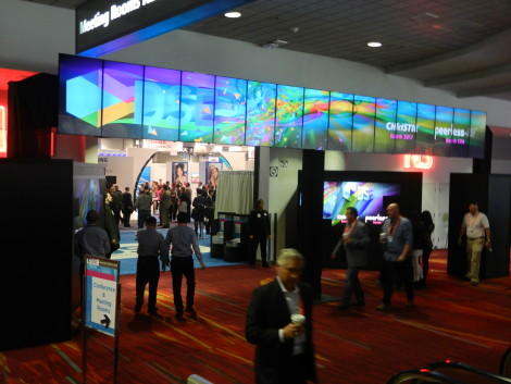
Already the classy Christie-designed entrance archway (see above) showed how Christie has been fast to utilise the artistic talents of Denys Lavigne‘s recently absorbed Arsenal Media’s design team and gave the show a smarter modern feel from the outset!
The rush at the door on opening was more like the January Sales than an orderly trade show, reflecting the keenness of visitors to get to their designated appointment on time or to their chosen supplier’s stand as early as possible. Rather naively I asked one exhibitor at 11.00 on Wednesday how their show was going and the response was a very enthusiastic “the show was great!” meaning they had already had enough business to make them happy…
And overall the talk was of the quality if not the quantity of visitors. Gone I think, were the tyre–kickers wanting to learn about digital signage. This year’s visitors were typically end-users who had already had some experience – had a budget installation three to five years ago and were ready to upgrade to higher quality screens, new software and other equipment.
In other words, they had (already) dipped their toes in the water, had a positive experience and were coming back to invest in higher-grade installations. What a great endorsement of the industry!
Several exhibitors that I talked to were very happy too with the numbers of leads generated – one admitted to a good 300 – while others reminded me of the hidden costs of exhibiting – its not just the rental cost and construction of the stand – its travel, hotel & entertainment cost of the staff – the costs for one exhibitor from north of the border amounted to $90K which means that those leads had better be good for the experience to be worthwhile.
There was indeed some innovation to be found at the show, with one medium sized screen manufacturer choosing to launch a new product at this show rather than waiting for #Infocomm15 – and risk being submerged by the Asian giants we were told, Ed and E Ink continuing to show (we saw them also at #CES2015 earlier this year) the progress they are making with bigger screens, and colour screens using their innovative technology.
There may not have been any of the massive overkill 4K, 8K LED based LCD displays that dominate the A/V shows like #ISE2015 (and of course #Infocomm15) but there was enough innovation on display here to keep our industry moving forward and most definitely enough interest from end-users to ensure the show a healthy future.
I thought that a lot of the innovation was software based (and so, far less visible when walking the floor – you needed to stop, meet with people and discuss in detail – something that the DailyDOOH team are well used to doing). In particular here I’m thinking of Control Group’s ground-breaking work on the MTA’s new totems and of Ayuda’s new supply-side platform (amply documented here).
In short, roll on #dse2016!


Follow DailyDOOH