New @elotouch McDonald’s Interactive Kiosks?
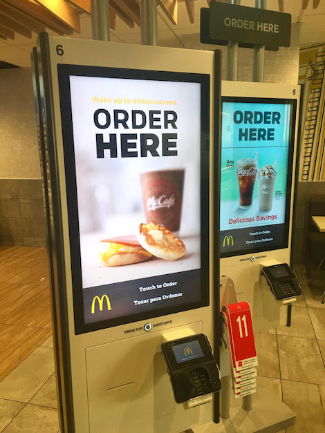
Here’s a very quick review of the highly anticipated, much talked about, McDonald’s Kiosks as seen in the Corona, Queens, NYC neighborhood. This restaurant had lots of back to back units, possibly as many as eight.

If we didn’t know any better I’d say that these are the units ELO had on display in their booth at #dse2017 – note the red number plastic tags, stacked to the side, for your use to indicate your order when you are seated.

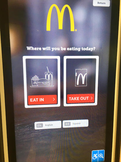
Placing an order was easy – whether it be EAT IN or TAKE OUT (as shown above), we’d go as far to say that the experience was very fluid and intuitive.
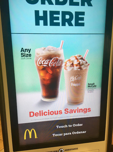
Two things perhaps to notice; first, the ‘native McDonald’s ads’ occupying the upper quadrant of the screen attempting to upsell other menu items while you are placing your order, and secondly the English/Spanish language selection on the ‘Order’ screen

The Check ‘Eat In/Take Out’ screen features an Accessible logo along with a magnifying icon.
These units were in a store located on Junction Blvd, a main shopping strip in the neighborhood that straddles Corona and Elmhurst (a heavily Spanish speaking neighborhood) in Queens, New York.

Follow DailyDOOH