Neue Haas Grotesk
Adrian J Cotterill, Editor-in-Chief

I asked the best out of home (OOH) content providers across Europe Middle East and Africa what their favourite font for digital signage was and why?
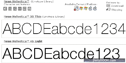
“It has to be Helvetica Neue. It is clear, concise, modern and most importantly beautifully crafted” says Dan Dawson, Art Director at Grand Visual.
“We are big fans of Interstate” says Steven Morahan of Captive People, “the reason why we often use interstate is that is was developed for legibility; it is the font used on highway signs in the US”.
I am told that if you shop at Sainsburys in the UK you’ll be familiar with it.
Chris Shields, from Lock On Productions Ltd says “I don’t have a favourite – although it must be sans serif, in fact it makes me angry when I see digital screens with serif fonts”.
I am sure you all know but serifs are the small strokes at the end of the main stroke of the character. Common sans serif typefaces include Arial, Helvetica, AvantGarde and Verdana.
Bryan Crotaz at AMX Inspired Signage, “our designers rave about Eric Gill. His Gill Sans is a beautiful font, available in a variety of weights. The thinner ones are particularly beautiful but need an HD screen to carry them off”.
Anthony Gambier-Parry, Creative Director at Denman Retail Media “the whole idea of a font is that it has an individual character. The use of fonts and colours are the building blocks of branding, corporate identity, mood and style, hence one uses a font to tell a story, in short one uses a font for a reason, not because one likes it” – so that told me!!!
Anthony continued “if however one looks at this from a technical perspective then this becomes more a question of readability. In this case one might argue that simple bold non-serif fonts are easier to read when created out of pixels and scan-lines because they are less prone to “aliasing”.
Darren Hanson – a senior motion graphics designer in the Kaleidovision studio says “I think the question should also encompass whether the font is right for the message it’s trying to convey and is it big enough to be legible”. When pushed for an answer he said “okay I’m not good at having favourites but at a push I like helvetica or univers the best”
http://www.helveticafilm.com/screenings.html
http://www.linotype.com/391/ericgill.html

Follow DailyDOOH