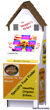
The Shopper’s Helper
We noticed this nicely titled “Shopper’s Helper” recently launched by KioStar
Described by the manufacturer as “the next generation in in-store marketing” the Shopper’s Helper is an interactive touch screen kiosk designed specifically for the supermarket industry.
 For supermarkets, the Shopper’s Helper drives sales storewide, instead of selling more of one product at the expense of competing products. It does this by interactively giving shoppers personalized offers and information about products they had purchased elsewhere, had never been aware of, or did not know enough about to buy.
For CPG Brands, the Shopper’s Helper provides a multimedia showcase for their products at the point of purchase. CPG Brands can provide multimedia demonstrations, recipes, coupons, buying suggestions, meal ideas, tips, helpful product details, nutritional information, or anything else to interested decision-making shoppers.
The Shopper’s Helper never bombards shoppers with unwanted advertising. Instead it interactively gives each shopper the offers and information that interest them. For example, a shopper interested in healthy foods receives offers and information on the type of healthy foods that interest them; a shopper that wants ready to eat meals, ethnic foods, food/wine pairings, fresh produce information or recipes, gets that.
The Shopper’s Helper also has information on sales and coupons. This not only helps shoppers save money, but can, over time, begin to reduce the amount of printing that CPG Brands must do, making this a very “green” capability.
The Shopper’s Helper is FREE to supermarkets and lets them include their own promotions, messages and private label items. CPG Brands pay a surprisingly affordable monthly fee to participate.


October 7th, 2009 at 20:06 @879
Interesting, I guess, but the packaging (including the ski lodge look and font choices) is dreadful. You can come up with a great concept and technology but if the store visual merchandising people look at this and say “No way in hell is that in our aisle” then it will not go far
October 7th, 2009 at 23:17 @012
I took a look at the Kiostar website and I love what they are doing.
It remains to be seen if the packaging will be successful. I personally like it for a grocery store. It seems accessible and welcoming. In a grocery store, high tech and sleek could be off-putting.
But I mainly think that the concept is top notch and the packaging can always be changed, if needed. That’s much better than a sleek package and a so-so value proposition. Look beyond the surface – Kiostar has a winner here.
October 8th, 2009 at 03:04 @169
totally agree it is what’s under the hood that matters, but there are plenty of tales of great cars that never got past a model year or two because they were butt ugly … a graphic designer would look at this and snicker
October 25th, 2009 at 18:10 @798
Hello,
I appreciate your comments.
We are aware that the look of our kiosk will not appeal to everyone – it is not supposed to. The Shopper’s Helper is designed to look like a little house, friendly, approachable, familiar.
Mr. Haynes believes, “a graphic designer would…snicker”. However, a graphic designer is not our target user. The Shopper’s Helper is designed for shoppers in a supermarket. In another venue, a completely different design would be preferable.
If anyone has any thoughts or feedback on the functionality and benefits of the Shopper’s Helper, I would be very interested in hearing them.