I strolled into my local Doctors’ Surgery a couple of days ago, booked myself in with the receptionist and sat down for what we are told in the UK is an average waiting time of around 20 minutes. I’ll keep my ailments to myself, aside from the fact that my condition did not degrade my ability to see or hear.

Spot the signage?
So it was with a fair degree of interest that as I took my seat I was greeted by my first experience of the AMScreen system in a healthcare environment (having seen them in BP service station stores and HMV).
Now I used to work for a well known network owner who supplies surgeries in the UK with reception and waiting room Captive Audience Networks (an older term perhaps, but one that ideally suits this medium where attention levels and dwell times are high and where long form content can thrive if not restricted to a sub 10″ creative window), so I’m pretty well advised when it comes to assessing such networks by virtue of the research I’ve seen and commissioned on the subject.
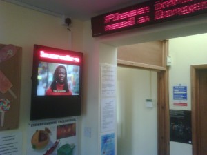
The unit itself is like every other unit you’ll see in ASDA, BP, HMV and so forth, so no surprises there.
Overall loop length looked around 10-15 minutes with smaller rotations of content within that cycle. There was no sound and with most of the content based on animated templates, not an issue although on the odd occasion where a full motion video was scheduled, it was subtitled.
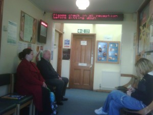
The quality of the screen was OK if you were sitting right in front of it however the screen itself was, in my opinion, poorly located – screens should be visible to all viewers all the time by virtue of screen position, size, clarity, viewing angles and if required, compensated by more screens to ensure coverage and visual impact. The simple metric is that if the screen network reaches only a percentage of the viewing audience then only that same percentage should be chargable as the audience. In this case, the opportunity to see (i.e. all patients) and the net audience (those sitting in front of the screen) maybe quite different.
In this instance, of the 12 seats in the reception area (four on the left wall, four on the right and four at the end), only four patients at any one time would have been able to see the screen meaning it was mechanically only ever capable of reaching a net 33% of the potential audience in this surgery’s waiting area. That’s before you factor in other variables such as screen awareness and opportunity to see which also always degrade a gross viewing number.
The AMScreen ticker which ran a “welcome to your surgery” generic scroll was a big flaw in this installation: it was fighting the existing LED ticker which was co-located adjacent to it. Two solutions to this vary in complexity. Firstly, put the next patient information on the AMScreen LED ticker which maybe difficult owing to an existing service contract or secondly, turn it off. The LED function added no meaningful value to the patient experience and detracted from both the core editorial & commercial messaging carried on the screen AND the surgeries own system.
 As to the content itself, the channel comprised of basic, generic messaging based on templates using what I thought looked like American stock photography, including “Welcome to your surgery / Please ensure you book yourself in at reception / Allow x weeks for jabs if going abroad / Tell us if you change address” etc each around 10 seconds.
Surprisingly, there was no surgery specific information (opening hours, Doctors name, clinic sessions, events etc). I asked the receptionist who brandished a one-page laminated piece of paper that was ostensibly a snagging list and helpline contact document and said she wasn’t sure but presumed that if they wanted their own content they would have to call AMScreen, who would charge them. The paperwork didn’t specify whether this was the case either way so it’s probably unlikely the surgery will in this case.
There was no news, weather, traffic, travel or anything else relating to a typical RSS-style of content feed (AMScreen do supply news and travel to their BP network) Some might say not including this is not necessarily a bad thing, but local news has always performed quite well (less so weather and traffic for reasons we all know about by now).
On balance however, AMScreen did a couple of things well:
1. Almost all editorial content originated from healthcare sources (the Department of Health, the UK’s healthcare agency) including smoking cessation, alcoholic unit awareness (a guide to consumption levels), keep fit and general wellbeing. It’s hard to know if this was paid for (as a campaign) or put on as a contra deal (i.e. to facilitate the installation of the screens at the time) but regardless of the route to screen, the editorial boxes were ticked.
2. Commercial partners were few but biggies: ads & advertorial smoking cessation content originated from Nicotinell and Pfizer was also present (although I can’t recall what for). There were a couple of short local ads presented on templates for plumbers and taxi companies.
3. The lack of sound was not an issue as the surgery has always had a DIY solution and this in itself kept the receptionists happy.
Lastly, inviting patients (who might own businesses and wish to advertise locally) to contact AMScreen via text is a simple and effective way of reaching out and sidestepping the thorny issue of working through receptionists or printing, hosting and replenishing leaflets. Although this information wasn’t mentioned on the bezel which seems like a wasted opportunity from a commercial perspective and that the use of mobile phones in surgeries is generally discouraged, mobile phones in this particular surgery were requested to be switched off.
So If I was asked by AMScreen to improve on my patient experience through the medium of digital media; I would recommend the following:
1. Position your screen so it is visible to everyone in the waiting room. Use more than one screen if necessary to improve coverage and visual reach.
2. Embrace the LED ‘next customer’ ticker by integrating it into your service (most UK waiting rooms use these) or position your screen as close to it as possible (it is THE priority messaging board after all).
3. Give staff the ability to update their own templates and content – for free – and make it inclusive to their working practise rather than an additional burden.
I can’t say I felt any better or worse having watched it, my perceived waiting time wasn’t notably reduced but I didn’t experience any particular “viewers remorse”, just a sense that there’s more work to be done, much more.


October 30th, 2009 at 13:41 @612
I found this to be an interesting, useful and balanced critique of this installation. What is surprising is that, despite so much available digital signage knowledge, the installation wasn’t more carefully implemented. Poor execution negates the potential effectiveness of digital signage as a visual communications medium, and in my humble opinion, can only serve to give this vehicle a bad rap.
October 30th, 2009 at 13:56 @622
Nice to see some real constructive information posted on this site. Good article.
November 4th, 2009 at 15:39 @694
Good info. We’re working with a client to make his healthcare network interactive, using smartphones. Not for talking on, but for interacting with the DooH content to render the experience and information 1-to-1 versus 1-to-many (only). The digital wall doesn’t change (so others keep watching whatever content is being delivered) but the user’s screen comes alive. We harness the mobile web, using bluetooth/wifi, etc. as needed.