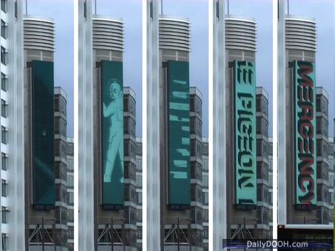
Sounds Like The Pigeon Detectives!

Lately I have been doing a lot of 15 and 20 second advertising spots that get shown on the massive (19m x 4m) City Gateway Media screen in Manchester Piccadilly. It is a unique screen due to its dimensions and from a design perspective that poses a number of challenges. The closest parallel I can draw is to that of designing for skyscraper banner advertising.
Over the next few weeks I will be posting a series of short items that analyse what kind of creative and creative techniques work best for this size format and how this has been achieved in current live projects we are working on. To kick this off I have chosen a campaign that is currently running on the Manchester screen promoting The Pigeon Detectives first album ‘Emergency’.
As is usually the case with our work for the majority of DOOH based design, we were supplied with the bare minimum which in this case was the album cover artwork and the band’s logo. Fortunately it was in vector based Illustrator format as opposed to bit-mapped Photoshop format, which basically allows us to scale any graphics and not lose any quality; small lo-res imagery is the bain of any screen designer’s life…
The next step was to develop a concept and animate what we had. As we could take apart each graphic element of the album artwork, we looked at the specific narrative which the original designer had developed for the cover – in this case it was about an army of spacemen ‘soldiers’, a radar and weaponry illustrated in a ‘how to manual’ style. The radar was the obvious route to start off the ad by animating the blip, but we wanted to go further and tell a story – what was the origin of that blip? – what was it, where was it and what was it doing? Hence the crash zoom into the blip at the start of the ad, the subsequent magnification of a line of ‘marching’ soldiers and the ‘disruption’ of the weaponry metaphor via the use of graphic interference and flashes of white that then introduces, in extremely large type, the title of their album: ‘Emergency’. The ‘Emergency’ idea was taken further to create an arresting, powerful animation style which was used throughout.
In a nutshell it looks pacy, edgy and you can’t miss it. In addition to the creative ideas above, why is this so?
- We ensured the graphics worked well with the unique screen size – we made full use of the vertical nature of the spacemen soldiers and we used the crash zoom technique to draw people in.
- The animation is actually made up of 4/5 shorter animated sequences – to enable us to maximise ‘glance’ awareness.
- We kept the colour palette simple and used white to ‘flash’ key points in the animation to grab attention.
- The album title and band name was kept massive and was animated – we have been told that you can see this screen from 1km away – we wanted to make sure you could read it from that distance.
The results seem to work, the client is certainly happy and I am currently looking for volunteers to stand 1km away from the screen to see if they can read the album title…

Follow DailyDOOH