Simply The Best
Based on the title alone I would expect a large number of you to immediately think of the one and only Tina Turner !!!
Which brings me onto this latest piece of creative for City Gateway Media and their huge 19m x 4m screen in Manchester. The international director for Tina Turner’s 2009 world tour wanted a piece of advertising that gave viewers a flavour of what her concerts are like and what it might like to be there – err, that will be one of the less demanding briefs then, Ed
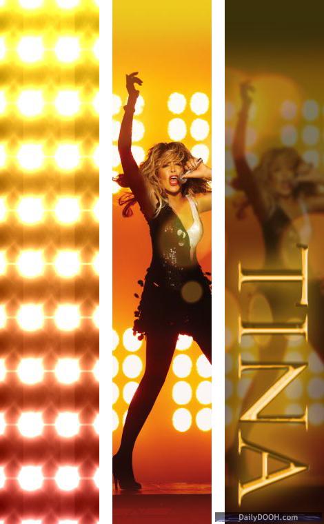
So rising to the challenge, there was only one image we could use – the woman herself, resplendent in the shortest of skirts (good for her!) and in full gravelly voiced swing.
Next the concert atmosphere – I like to focus on the scale of this screen when I design – the sheer massiveness of it and figure out ways in which we can ‘light up the sky’ to a certain extent – so for a pop concert it had to be huge stage lights in a dramatic burst, maintaining that feel throughout the advert with some 3D lighting effects whilst the key dates and venue information is displayed.
All polished off with a gold, gilt edged ‘Tina Turner’ font and you have something approaching the desired effect.
I was offered the use of previous concert footage but aside from not being able to hear music, I think that a few simple yet striking, powerful images and design components, in addition to using dramatic effects is sometimes more powerful than traditional video or moving image. In this case the design also complemented her world tour promotional website, existing online banner advertising and press campaigns – important in illustrating how well Digital Out of Home can sit within the traditional media and marketing mix.


Follow DailyDOOH