Amigo Digital is currently in New York City for the launch of Christie Digital’s MicroTiles on Wednesday and working with Denys Lavigne’s team at Arsenal Media, we are just putting the finishing touches to the content to be played out on the launch night itself. We took a sneak peak this afternoon at the set up at The Touch Club – the venue for the launch – and are pleased to say that the MicroTiles look as stunning as ever.

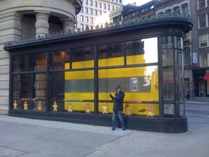
LED installed in flatiron building window, NYC
We were downtown early Sunday morning recovering from jetlag and came across this screen right at the apex of the gorgeous Flatiron building which illustrates the point perfectly.
In the window is an interesting installation for Sprint – note how a simple elongated shape is being played with here – and the screen itself is part of a larger ‘showcase’ type housing.
This is all good except for the quality of the screen (it’s an LED and looks awful close up) and more specifically, as this photo shows, the very poor quality of the black colour on display!
Black provides great contrast for saturated colours, makes text and graphics more legible and generally makes for a more crisp end result – in fact you cannot really underestimate the importance of black within the context of any moving image content.
When you find a display technology like Christie’s Microtile’s that does black so well, you really do realise black is most definitely back!

Follow DailyDOOH