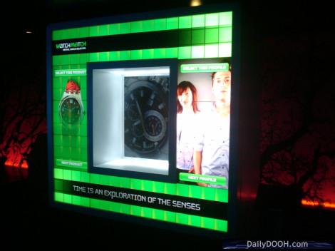
All the folks working on the Christie Digital MicroTiles launch for this evening have dubbed this particular shape, ‘The Big O’ – the Issy-Neale Formula for it is _4X5_4T_THHT_THHT_THHT_4T_ that’s accurate but less catchy!
It’s definitely one of our favourites. Note how easy it is to put retail merchandise in the middle of shape…

It’s made up of 14 MicroTiles, 3 ECUs and 3 playout PCs. It’s made interactive (there are a number of large on-screen buttons on each side of the unit that allow users to choose product) as it is powered by Float 4 Interactive software.
Content on this particular display was put together by Arsenal Media and as the picture shows, is mocked up to be for use in a retail watch / jewellery environment.
A great example of an innovative (and interactive) branded fixture, undoubtedly as Adrian would say “Shape is indeed the new king”
There is talk of making this double sided. How cool would that be as an exhibit in the centre of a stand at a trade show or indeed as part of retail theatre? This is the shape by the way that we are hoping to have on our Blogger Lounge in Amsterdam.

December 9th, 2009 at 14:34 @648
Very cool looking…. but is that 14 MicroTiles, or 14 x 12 MicroTiles? Is each visible square one discrete MicroTile unit?
December 9th, 2009 at 15:20 @680
This installation is made of 14 MicroTiles, 4 on the top row, 4 on the bottom row; then 3 on each sides in the middle portion complete the structure. For this concept, we developed interactive gesture-based controls mainly in the middle portion of the structure, easily accessible for users, but they actually control the whole big O screen surface.
December 9th, 2009 at 20:07 @880
Thanks Denys, I Think I get it now… the lines that look like bezels are not actually individual MicroTiles… but each 4×3 surface is one MicroTile unit. Sorry, just the uninitiated getting up to speed. By the way, the presentation is nicely done.