7 Seconds Give You ‘Empty Moments’
Adrian J Cotterill, Editor-in-Chief

EYE‘s 7 second clips or Clear Channel / JC Decaux’s more (read ‘convenient to sell and schedule’) evenly-spaced 10 seconds ???
10 seconds followed by 10, 10, 10, 10 and 10 to make up the 1 minute loop, as Clear Channel are planning on doing with VMG’s digital panels in shopping malls (as many others are) is easy to calculate, compute, schedule and sell but we feel that you lose the ’empty moments’ that Eye corporation make extensive use of.
The ’empty moments’ are the 3 second gaps at the end of each 30 second segue that EYE Corporation feel is important for ‘look-away time’ or that space for the venue’s own logo. All content ‘wears-out’ over time and we think that EYE corp have a good point.
Back to back 10 second clips can be hard on the eyes as well!
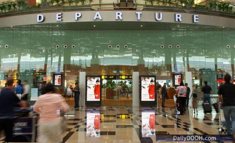
EYE Corp, we believe, originally came up with the 7 second length by working backwards from the time available to consumers as they walked to one of their airport / mall posters.
Interestingly US Gas Station TV has published a new study to encourage advertisers to switch from 30 second spots, obviously a standard TV unit, to shorter lengths on its digital signage network. Research conducted by Nielsen for GSTV showed ad recall for 15 second and even 10 second spots was more effective.
We also recently noticed that Titan’s digital 6 sheets seemed to be scheduled to play out 7 seconds.


August 26th, 2008 at 13:22 @598
I can’t agree that a 3-second ‘gap’ is appropriate – it looks messy (does your television channel do this?) and is probably more likely to hide issues with software than be for a reason.
However, we must all remember a few basic premises which I think Adrian is highlighting:
1. Humans react to changes – this is why we don’t notice a tree growing, but a turn indicator on a car flashes to make us notice.
2. Timing is important – Another human trait is boredom. Whilst standing in a queue (line!), people are looking for something that it of interest to them, so although the ‘dwell time’ is longer, the attention span is much shorter. Again, during television advert breaks, when the person is relaxing they are much more appreciative of the 30 second long adverts – but of course these dont work on OOH.
3. It isn’t televsion – although I said a comment above comparing it to televsion, remember the OOH is just that – out of home. People have less time and less patience when not in the comfort of their lounge – this is why interactive kiosks shouldn’t just show websites on them for the same reason.
3. Humans react to changes – yes I know I said that, but (when legally possible) rather than just changing the content, make the content change – use Flash animations, interesting videos, or just transitions between the content images to re-attract flagging viewers.
Basically, in our experience 30 second slots are too long (especially if matching a TV campaign and reusing TV commericals), and if the overall playlist is long enough to match dwell times, and the content is interesting OR animated, any of the 7, 10, 12 15 or any size slot should be appropriate. The industry just needs to standardise so that (a) advertisers can be sure what they are getting and (b) so that animated/video content doesnt’ need to be repurposed/edited.
Also… is it me, or does a 7 second slot = more advertisers = more income in the same amount of time?