With all the snow we have been having, entertaining one’s 6 year old son has become somewhat of a challenge whilst he has been off school.
Inevitably I succumbed to taking him and 2 of his mates to McDonalds one lunchtime after a particularly strenuous bout of tenpin bowling.
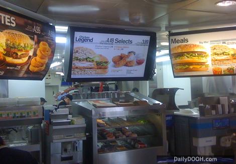
Whilst there I noticed the DIgital Signage they have installed above the counter.
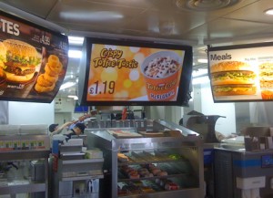
As I was waiting for my 3 Happy Meals I was struck by how good the design and the installation was – the font used is extremely clear and the size is spot on, colours are used well and totally on brand – the layout and most importantly the size of the pictures of the various meals, drinks and price options is superb and easy to view/read and the whole look and feel of the information design is easy on the eye and most importantly gives the reader simple access to the key information quickly.From an installation point of view, the quality of the screens was great, they were positioned at perfect sight level and were well integrated with the static signage and did not look like an add-on as a lot of digital signage screens can do.
It worked too! I spend a fair amount of time commenting on digital signage and in this instance I didn’t notice the screens because of my job – I noticed them because of the advert for the Toffee Crisp McFlurry that I was tempted by – and in this case the advert got me!
I bought 4 of them – which went down particularly well with the three 6 year olds in my company!


January 14th, 2010 at 14:49 @659
There is no escaping your spies. This is one of a number of sites that EnQii installed in 2008 and given the great test results the project turned into reality and we have continued the success across the UK I am glad to see you succumbed to the current promotion too!
January 14th, 2010 at 16:15 @718
You forgot to mention the sixteen cheeseburgers you ordered too Alex?