#ScreenMediaExpo – New Website Looks Good
The new web site for Screenmedia expo Europe 2010 has now officially been launched and we have to say, especially for a conference, the web site looks pretty good.
 As our readers will no doubt be aware, we spend a lot of time reporting from all the big (and relevant) shows and conferences, after #NABShow and #KioskCom (both in Las Vegas in April) the next big one for us is Screenmedia expo in London in May.
We do a lot of research on the exhibitions and conferences, mainly through our network of contacts, the organisers of the events whom we know well and obviously their associated websites.
In doing so, we have noticed that in a lot of cases whilst the conferences/exhibitions are great, the websites used to promote them often fall far short of the events themselves.
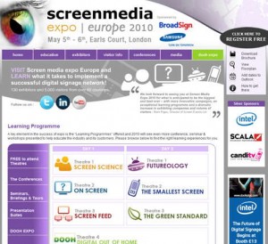
The new site for #ScreenMediaExpo was designed by Lockon Productions and the site looks to us to have set itself apart from its competitors.
Branding & Design
As you know we like our branding and design and the site’s design is bold, simple and on brand. This year they have really gone to town on imagery and symbolism, using key icons to represent different parts of the very extensive learning programme. Due to the vastness of the event it looks like they have simplified the main menu, allowing for better usability and navigation – this site is refreshingly easy to use.
Content
The site is saturated with different kinds of learning programmes, workshops and seminars and there is a ‘quick menu’ on the site home page which allows users to look through the various programmes instead of searching through the main menu and site pages. There is also the opportunity to for viewers to watch last year’s much popular virals online via a dedicated video page.
Site Purpose
According to the designers at Lockon, the purpose of the site is to act as not only a point of reference but also…
- An opportunity for attendees to learn more about what’s happening at the show
- Allow attendees to arrange meetings with various exhibitors
- Allows companies exhibiting at the show to showcase their products
- Helps build awareness about digital out of home media, content and the benefit is has on a wide range verticals
We think it does this perfectly and it’s certainly a lot better this year in that the learning programme is simpler (screen science, futureology, onscreen etc.) so attendees will surely find it much easier to identify which areas matter to them.
In our opinion this is how all conference websites SHOULD be designed; in a nutshell –
- Simple navigation
- Consistent branding and colour
- Vital information at hand
- Dedicated micro-site that allows for better organisation of information
- Engaging and dynamic
If the expo is as good as the website, as it surely will be, the industry can only be on to a winner!

Follow DailyDOOH