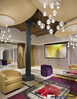
Luxottica’s ILORI Store, New York
Adrian J Cotterill, Editor-in-Chief

One tends not to figure STRATACACHE playing in the retail space, but they seem to a lot more than people (including us) actually think – their obvious high profile retail victory was the AT&T iPhone launch (1,840 stores) but in retail they also have folks like Home Depot as customers.
Here we see them supplying the technology underpinnings for Luxottica.
Eric Feigenbaum writes over on VMSD…
Merchandising high-end eyewear can be a hard sell in a soft economy. But Luxottica addresses that challenge head-on with its new ILORI store in New York, which serves as a glamorous showcase for the impressive roster of designer brands.
The concept for the SoHo store, created by Craig Nealy Architects LLP (New York), offers its upscale customers a treasure hunt in a gallery of eyewear where the merchandise (which ranges in price from $150 to $20,000) is presented in a simple, elegant, user-friendly format.
The patrons spending that money are pampered with chocolate and champagne. All the employees (they’re called “partners”) have backgrounds in hospitality and take a two-week immersion into the ILORI experience, where eyewear is regarded as an integral part of a fashion wardrobe.
The ILORI luxury eyewear environment is defined by a compelling variation of fixtures and presentation formats. The signature visual statement at the retailer’s SoHo store is a repetition of three architectural piers that present open-sell merchandise in a gallery-like atmosphere.
Customers are enticed into this store – as into ILORI’s other flagship, on Rodeo Drive in Beverly Hills – by a dramatic grouping of architectural piers. The elaborate millwork of the floor-to-ceiling structures creates a dynamic energy that continues throughout the environment. The piers, positioned toward the front, feature open-sell merchandise on horizontal relief shelves. Up-lighting celebrates the color of the eyewear, making the merchandise appear to glow. Completing the effect is the ethereal projection of a seasonal graphic onto the upper section of each pier.
The customer is drawn to the high-end selling section of the store by undulating walls and a rich colors and materials palette.
A focal wall at the left of the entry area serves as “the voice of ILORI,” posting brand messages on the faces of three back-lit mirrors sequenced horizontally across the wall. A workhorse capacity wall system, inspired by the artist Piet Mondrian, features a series of color-blocked, tinted Plexiglas squares. Touch-latch, pop-open storage compartments allow for bulk assortment presentations while still maintaining a strong visual impact. “The Mondrian wall is a delicate balance of positive and negative space,” says David Kepron, vp in charge of retail design for spg3 (Philadelphia), the architect of record. “It’s not merely rack ’em and pack ’em. We endeavored to present luxury items in an artistic way.”
A beautiful rhythm of form draws customers to the rear quadrant of the store, where the arms of a concave gold wall announce the high-end luxury portion of the environment. A lighting fixture by Bocci (Vancouver, B.C.), a series of 14 illuminated hanging balls, serves as architectural ornamentation, adding sparkle and glamour to the area.
Inspired by artist Piet Mondrian, this capacity wall unit offers a high volume of merchandise in an artistic and functional manner.
Eyewear is a difficult classification to present because the product is small, the offering is numerous and it’s hard to tell the high-end from the commodity. The challenge is to present the merchandise in a meaningful manner, make the selection process as easy as possible and have the store serve as your brand. So the ILORI experience is about story-telling, discovery and an appreciation of beauty, says Bink Zengel, senior director of design, branded environments, for Luxottica. “Our merchandising techniques highlight the characteristics of the product offering in a gallery-like, touch-and-feel setting to help customers navigate the space. Ultimately, we hope our customers have a great time in our stores.”
Customer amenities are the hallmark of the ILORI brand, so prime front and forward square footage is devoted to customer comfort in the form of opulent residential leather seating.
Client: Luxottica Retail, Cincinnati — Bink Zengel, senior director of branded environments; Jay Kratz, senior design manager; Tim Sheldon, industrial designer; Bobbie Koontz, project coordinator; Peggy Colvin, signage/graphics manager; Adrienne Ruebusch, senior project manager – construction
Design Architect: Craig Nealy Architects, New York
Architect of Record: spg3, Philadelphia
Project Manager, Construction: Turner Construction, Cincinnati
General Contractor: McKenzie Keck, Hackettstown, N.J.
Millwork & Fixtures: MG Concepts, Central Islip, N.Y.
Furniture: Forma & Design, Norwalk, Conn.
Lighting: Turtle & Hughes, Linden, N.J.; JKLM Lighting Design, New York; Bocci, Vancouver, B.C.
Flooring: Mees Distributors, Cincinnati; Garden State Tile, Port Reading, N.J.
Visuals Tools: Matrix, Hastings on Hudson, N.Y.; Color Brite, Cincinnati
Technology: Stratacache, Dayton, Ohio
Signage: Triangle Signs, Baltimore
Photography: Mark Steele Photography, Columbus, Ohio

Follow DailyDOOH