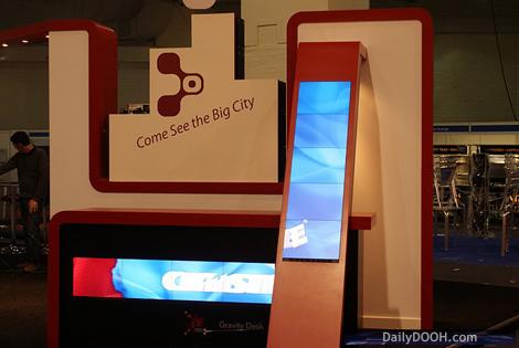
At #ScreenMediaExpo, many of you who visited might have noticed at the front of the Christie Digital stand, their welcome desk. This was actually what could be termed a piece of Furniture+. Not only was it a desk but it was a desk with an integrated horizontal screen and a side column with an integrated vertical screen on a slope.
This gave us a number of opportunities to play with a variety of ideas based on corporate welcome messaging and signage as well as looking at how the physical nature of the vertical screen and its slope could relate to the dynamic content on the screen itself.
In this instance, we used the 2 brands – Christie and MicroTiles and interchanged them via an animation that linked the physical nature of both screens. Animating the Christie logo to ‘swoop’ into the vertical screen, and then ‘slide and fall’ the MicroTiles branding into the horizontal desk screen were both ways in which we played with the content and the physical screens themselves. It certainly makes for interesting viewing and we are looking to play on this ‘physical structure/dynamic content’ idea for Christie in the near future.


Follow DailyDOOH