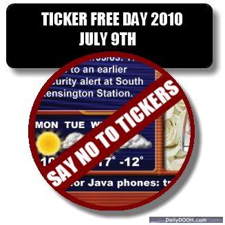
#tickerfree2010 – Ticker Free Day 2010
Adrian J Cotterill, Editor-in-Chief
Repeat after me, “I pledge to support TICKER FREE DAY 2010: Fighting Digital Signage Ticker Abuse”
 Great article and serious initiative from David Weinfeld documented over on his blog in a post entitled ‘Ticker Free Day 2010: Fighting Digital Signage Ticker Abuse’
Well worth a read here and of course do please support if you agree…
WHAT IS “TICKER FREE DAY 2010”
A day that digital signage networks abstain from using tickers on their displays. TICKER FREE DAY is meant to bring awareness to the rampant abuse of text tickers, RSS tickers, stock tickers, etc. throughout the digital signage industry. By eliminating tickers from their programming for a single day, digital signage organizations across the globe will be coming together to show that networks can function without tickers.
WHEN IS “TICKER FREE DAY 2010”
Friday, July 9th (12am – Midnight)

June 9th, 2010 at 15:19 @680
I struggle to see how all tickers are awful. Agreed they are not wholly appropriate for the majority of DOOH and are rather old hat as an information source plus they effectively split a screen and double the information / communication for a consumer to take in, however when considered carefully they can genuinely be effective:
The deployment of the TfL ticker on the Coca-Cola Piccadilly Sign,
(see here: http://www.marketingmagazine.co.uk/news/921283/Watch-Coca-Colas-Tube-Ticker-travel-update-service-Piccadilly-Circus-sign?DCMP=ILC-SEARCH)
was born out insight gained from robust qual research of those who pass through the area regularly. When shown a mock up of the idea, in every group I sat in on did they say it was a fantastic idea and would genuinely act as useful service to enable commuters decide what public transport to take. Indeed I have seen not only Londoners but tourists plan their next journey by waiting for the next play of ticker whilst referring to a tube map.
All of this is seen as useful service, brought to them by Coca-Cola, and is played on a animation featuring Tube Trains and Route-Master Buses: so content appropriate to the context of the area and amplifying the core creative idea.
June 9th, 2010 at 18:08 @797
“the awfulness of tickers”? We don’t currently use tickers but have been asked many times by venue proprietors if we could implement them. Can’t see that they are all “awful” – many appear to be quite useful. There is no single solution that fits all signage needs and tickers have a role. Sounds like a silly point of view.
June 22nd, 2010 at 11:37 @526
Asking people if they see the value in presenting news on a screen will, I’m guessing, reliably produce a positive response. The point of this is not so much the content as it is the presentation of the content.
Tickers are ineffective ways of presenting information because the crawling and scrolling nature of them means the messages are usually only partial, and force viewer eyes to lock on them and wait while the rest of message rolls in.
Tickers also make the leap in faith that human brains are capable of effectively seeing and absorbing multiple pieces of information on a zoned screen at once, and require viewers to stick with them (if they do) instead of looking at the ads or marketing messages that are the usually the reason the screens are even there.
If the venue or network operator insists on news headlines (and there are rarely strong arguments for them), at least show complete headlines or thoughts at once in a zone, or even better, go full screen.
My suspicion is that the two biggest reasons so many networks have tickers is that they emulate what people see on TV news channels (different medium, different viewer dynamic) and because they see everyone doing them so they must be the thing to do. But they’re not.
June 22nd, 2010 at 13:51 @619
The vast majority of our clients have taken the approach of ‘share the time, not the space’ because simply put; sharing the screen simultaneously between 2 competing pieces of information immediately halves the effective audience as a viewer can only consume one message at a time. So if you are in the business of revenue generation from advertising AND you have sophisticated clients/buyers who get how to measure an audience (in terms of eyes on) then its generally full screen rather than ‘Nascar’ing the screen up’ that is the preference.