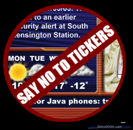
I was on the train to London this morning using my iPad to catch up on a few emails and have a bit of a browse when it struck me that you wouldn’t see a ticker on an iPad.
 OK, I may be stretching the DOOH metaphor a little when I suggest that the iPad is true DOOH but it is a form of signage, wayfinding and is starting to become a comprehensive advertising platform yet I am still not subjected to a ticker.
Personally I think that tickers are an easy option, a mostly ill considered way of populating screen real estate without much thought to design or content layout.
In theory they should work – snippets of information delivered in an easily digested format.
However the theory is rarely seen in practice. So being a bit of an Apple fanboy I started thinking about how Steve Jobs would design the ticker – what would Ticker 2.0 look like?
Tricky one. Would it not be more visual, more graphic, more integrated into the layout of the design of the content itself?
Kind of like a rich RSS feed perhaps. In that case would it not be a ticker at all and simply be another design element or content mechanism that can be easily populated with facts, information, news and imagery?
It is surely up to designers to think about this further and take on the challenge of designing the Ticker 2.0 and the Ticker Free Day is a great way to turn off your existing tickers and come up with some interesting alternatives instead!

Follow DailyDOOH