Creative Use Of 3D Space
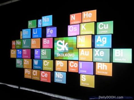
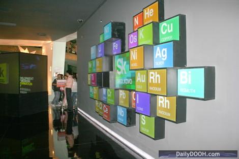
These pictures have just come through of this (predominantly) Christie MicroTile display in the Russian pavilion at the World Expo 2010 in Shanghai. The 28th Sept there was Russia Day, which was opened by the Russian President, Dmitry Medvedev.
 This display is part of a new exhibition recently opened this month in the pavilion, promoting the ambitious Skolkovo project outside Moscow, which Russians are referring to as the “Russian Silicon Valley”.
We think this is a very creative use of screen shape, with the screen design and content reflecting chemical elements and their symbols with references to the classic Periodic table in chemistry.
As can be seen in the pictures, they have also played on the cube shape of the tiles to create a three dimensional element to the display, with tiles being placed at different depths, rather than just forming a flat surface.
This display poses some interesting questions as far as the Issy-Neale Formula is concerned, as currently it is only designed to describe tiled screens where the tile elements are in the same plane. We haven’t yet found an elegant way of describing non-planar displays such as this.
So the current description for this display looking head-on from the front is:
_10X6_2H4THT2H_H8TH_10T_9TH_H4TH3TH_2H3TH2T2H_
This is the first Russian pavilion at the expo in 30 years. and is proving popular. The number of visitors is reported to have exceeded 6 million so far out of the Expo total of 55 million, slightly bigger than the trade shows we’re all used to (Twitter statistics not available from us on this one, either). The Expo runs until the end of October.


September 29th, 2010 at 20:24 @892
It doesn’t seem like you’d need to concern yourself with the depth (z-axis) portion of the description since you’re never showing more than one image in the same xy area. Rather, your description above is sufficient for describing the pixel mapping, and somebody could certainly make the right shape/size content from it.
Now where it would get ugly is if they had used more times on the sides of the protruding faces…
September 30th, 2010 at 13:01 @584
You’re absolutely right – it’s fine from a content perspective.
Our aim is for it to be used to describe accurately the physical display as well, and it’s in that respect that the non-planar aspect needs looking at.