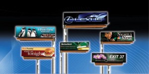
Digital Billboard Content Guidelines
Adrian J Cotterill, Editor-in-Chief
‘Simple. Bold. Legible. Brief’ is just one suggestion in Daktronics‘ Digital Billboard Content Guidelines which were released to the general public this week (they had previously only been available to Daktronics’ customers).
 Put simply, there is a lot of great stuff in the guidelines and whether you are designing for a giant LED billboard (that doesn’t like white) or an LCD (that doesn’t usually care) – whether you are a seasoned professional or slightly less so there is a hell of a lot in this document for you to learn, remember or simply do a ‘brain refresh’.
Like Christie Digital and like LG, Daktronics seem to truly realise that their technology can only be shown to its best affect with careful thought on content.
Gina Peterson, Daktronics commercial creative services manager told us “When an outdoor company purchases a digital billboard, they should utilize its full capabilities. Effective digital billboard content is absolutely critical for outdoor advertising companies to realize occupancy rates they expect. We want our outdoor companies to benefit from our more than 40 years of experience in LED technology and more than 20 years as professional digital artists.”
The guide reveals best design practice topics as they relate to digital outdoor displays and digital billboards, such as:
To obtain a free copy of the guide call 888-325-7446 ext. 57220. or email commercialcreativeservices@daktronics.com

March 17th, 2011 at 01:57 @123
Were you able to get this document by chance? I’d love to see it. I’ve tried emailing and calling them multiple times to no avail.