You Have To Know Your Airport’s Dynamics
JCDecaux’s work in airports is a good example of a company that has analysed and understood the space it is working with and its dynamics, to deliver a modern and flexible canvas for advertisers. I have had the privilege of getting a private tour around Terminal 5 at Heathrow this month with Liz Ross Martyn.
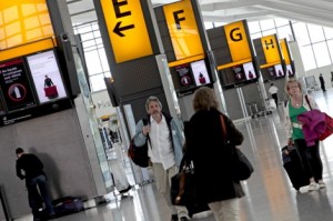
What are airports for us today? What do they mean to the digital signage industry? Perhaps we could define them as an exclusive shopping centre with a runway attached, where people spend a short amount of time – but could be productive in terms of shopping, I know it always is for me.
“In one of our surveys,” Ross Martyn comments, “we have a lovely quote from a guy saying that in the airport he feels like a millionaire.”
When travelers set off to Heathrow, they have their first encounter with digital signage on the Heathrow express trains. Ross Martyn points out: “this is really the start of the journey. Once they alight at the airport, the messages continue on the screens on the train platform and the ones leading to the lifts or escalators, some of which are interactive.”
At the departure lounge there are always people dashing about a little worried trying to find their flight, the check in desk, keep their bags –and children – with them. Having clear information beacons is of great help. JCDecaux has taken media space at these beacons, on the transit ways and at the security check desks.
So you are through security, the airport is your oyster! People have time to kill and this provides a wealth of opportunities for advertisers and media owners to do business. However, there needs to be a bit of planning and thought behind it. “We truly believe in less is more, and T5 is a good example of it,” says Ross Martyn.
JCDecaux talked about its ‘less is more’ strategy for its UK airport portfolio, last year. This move was not just to reduce visual clutter at airports but also to simplify the buying and planning process for its clients.
One key thing for JCDecaux, has been naming the posters’ sites. The names have been chosen according to their position, size and the role they play in communicating with airport visitors. “This move has made it simpler for us to explain to our clients what they will be getting according to what they buy,” explains Ross Martyn.
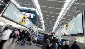
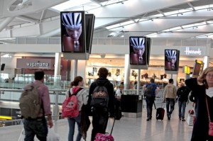
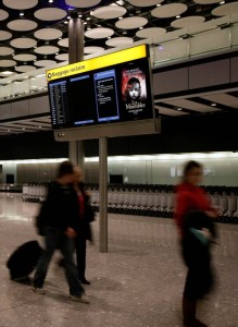
While before the company had airport floor plans with model numbers, to indicate what type of publicity space they were offering, now they have chosen names for each of them. ‘Impact’ (it’s for the big posters), ‘Broadcast’ (digital screens across a network that accompany the visitors on their journey) and ‘Touch’ (interactive). You can also find “Global Gateways”, which are by the security search areas and at present feature very beautiful non digital General Electrics posters with subtle Electro-Luminescent animation. “Couture” panels, by the aute couture stores, deliver exceptional quality presentation in locations designed to influence the high-end shopping opportunity. Of special beauty is JCDecaux’s Digital Runway, which is a line of screens relatively closely installed that hang overhead on the walk paths by the main shopping area.The naming of the posters was based on the Airport Ethnographic Research (AER) that analysed passenger mindsets at different points in the airport journey. AER shows that appropriate panels should be positioned to reach passengers in the right mindset to engage with the message. This was translated into a product placement strategy based around right time, right mindset and right product.
But there is more. Gates waiting areas have TV screens that are also part of JCDecaux network. The walls at T5 are not painted or tiled, instead they have big glass panels in a off white greenish colour. The digital screens embedded in the glass walls look sleek and appropriate. Being a new terminal, the technology was accounted for from the beginning.
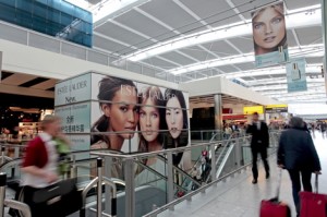 A very interesting contrast was between departures and arrivals. Yes, on this tour I went from departures to arrivals without actually leaving the airport – but I did have a spot of shopping anyway. While departures is light and airy and very inviting, arrivals, on the other hand in not so. The bags pick up area is darker, smaller and it’s saying to you, in a subtle way ‘Off you go, take your bag, we are done here.’ But there is a lot to be done in this space still and JCDecaux has been doing its research.
The type of content on the arrival screens is more practical. There are ‘Welcome to London’ posters and some nice big static posters dominating the overhead space on the luggage reclaim.
We know, JCDecaux doesn’t just do digital advertising, its static advertising is also to be noted. Digital and traditional work in harmony to deliver their messages. If you visit T5 have a look at the Estee Lauder campaign, which dominates the lift shaft and ceiling hanging banners.
After working at the airport for years, JCDecaux ‘knows its onions.’ The company is launching a new report next month to talk about its work in airports and in particular on arrivals, called ‘Arrivals Unlocked.’
- Estee Lauder -No 1 Fifth Avenue and C-Suite banners

October 7th, 2011 at 16:24 @725
Great to see more airports creating digital solutions to really engage with consumers. Geny, I can’t wait to show you some of the exciting developments that have been taking place at Gatwick next month!