#MWLive2012 Round-up
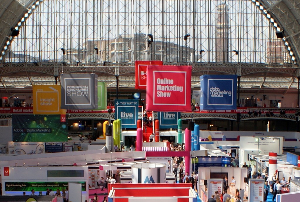
Held at the end of June, Marketing Week Live 2012 was bigger and busier than we have ever seen it.
There are now seven sub-shows built into the whole event, spread over two days in the Grand Hall at London’s Olympia Exhibition Centre.
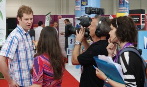 Silverstream TV were on once again on hand with their own studio set next to the production truck in the Village area, and roving cameras and reporters.
Throughout the two show days, they produce what we think is one of the best live TV show coverage productions we’ve seen at any event anywhere – and yes folks that includes IBC and NAB, Ed.
The programme they produce flows naturally through a mixture of live interviews with people (attendees and exhibitors) on the show floor, longer interviews in the studio area, together with some pre-recorded inserts.
It hangs together particularly well, and the presenters appear informed and well briefed, and certainly in step with the attendees and industry professionals they talk to.
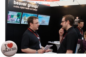
In the In-Store section of the show Beaver Group were showing various recent examples of retail executions, including digital menu boards and their nice interactive wayfinding map of Canary Wharf in London’s Docklands which we first saw shown back at #dse2012 in March.
This is of course powered by Scala, with some clever script programming thrown in.
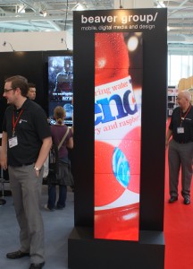 Beaver Group were also showing a nicely designed video totem column using Christie MicroTiles as the display mechanism (shown here to the left).
Visitors were given a slightly cheeky ‘I Love Beaver’ badge by Managing Director Peter Critchley, although we might decide to be selective when wearing it, for fear of misinterpretation – err especially abroad, eh? Ed
Generally, exhibitors seemed very pleased with the quality of leads, with some big brand name companies in evidence as exhibitors.
We heard that some weren’t too happy with the In-Store Show area having been shunted upstairs at the back of the hall at fairly short notice, and worried about the potentially lighter foot-fall, but they’ve been promised by the organisers that it will be downstairs for next year’s show.
If this happens, it looks like there might need to be a substantial floor layout change next time round, as In-Store is one of the biggest of the seven areas.
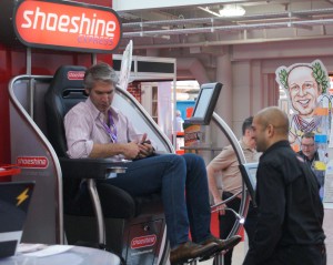 We first saw Shoeshine Express on the BBC TV programme Dragon’s Den, where Ronan McCarthy pitched for investment.
Here they were on the 3G Metal Fabrications stand, bespoke retail display builders, and the company who originally made the first booth for Shoeshine. On display was an updated and more modular shoe shine station concept featuring a screen for the customer to look at while the shining goes on.
![]() Pixel Inspiration had one of the bigger stands and featured a number of nicely designed displays and enclosures, mainly courtesy of their partner 10 Squared.
Pixel Inspiration had one of the bigger stands and featured a number of nicely designed displays and enclosures, mainly courtesy of their partner 10 Squared.
Their curved column of MicroTiles which debuted at #ScreenMediaExpo last year still looked classy.
MediaZest’s virtual mannequin was on display, as were a growing number of derivative versions.
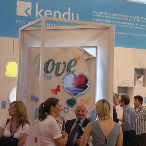 Kendu showed a nice display in context with a panel screen behind a heart shaped cut out – simple, but effective.
The eagle-eyed can spot the ‘nice’ David Williams in the picture standing just near it.
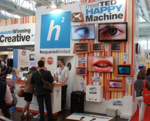 The H Squared stand was probably the most striking from a display point of view.
They had a wall of video (rather than a video wall in the traditional sense) with disparate screens showing a co-ordinated display of cleverly programmed content.
TED or Technology Engagement Device (shown here to the left), was interactive, using QR codes to lead people to a competition website.
They certainly generated even more attention with the competition give-aways every hour which proved very popular judging by the sudden crowds of people appearing for them.
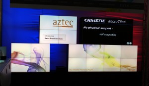 In the Live Marketing section, we saw Aztec Event Services going to town with a range of different MicroTile shapes on display, including the little O shape, and a horizontal desk.
Their biggest display (see picture) was formed of a number of displays with co-ordinated content, sort of building blocks made of free standing tiles fixed together in mini-shapes.
The Live Marketing section was a new addition to the show, being made up largely of those from the Event & Exhibiting Show which has merged with MWLive from this year.
All in all a great show that obviously gave #ScreenmediaExpo a run for its money – judging by those in the industry who decided to exhibit here rather than there back in May.
Categories: DailyDOOH Update
