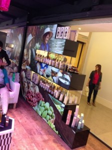
As Andrew posted yesterday, there is a new retail installation in one of the Harrods windows in London, see ‘Thailand Tourism Harrods Window Display‘ which seems to have caught the industry’s attention.
 There are a number of aspects to this installation that are creatively original and worth further examination.
The first thing that struck me was that we have never seen until now, an installation of MicroTiles whose structure and shape seems to emanate from one of the sides rather than the base.
The majority of MicroTile installations to date have a structure that is founded upon a base line – i.e. the construction is predominantly ‘upwards’.
Possibly the suspended Mosaic screens we have seen at the London Stock Exchange, the video wall at the head office of Christie Digital Systems USA in Cypress and the Russian Periodic Table installations could be argued to emanate from the centre, however I would still argue that most screens seem to have a ‘base’.
 What is intriguing and I believe visually stimulating about this Harrods install and its shape is that the MicroTile construction seems to be ‘suspended’ from the left with ‘rows’ shooting out to the right. This creates a highly attractive and noticeable screen shape and design that is instantly appealing.
Of course, what is also REALLY clever is the way this has been achieved and how this has been put to use for an additional function to display retail product.
To support the structure, vertical perspex supports have been positioned at MicroTile intervals to add structure and stability to the array whilst also providing a unique display cavity within which to position product relevant to the content.
These products are ‘housed’ perfectly within these cavities as opposed to being an afterthought using the MicroTiles as some sort of temporary add-on shelf.
Previously we have only really seen a few integrated modular retail displays; the Big ‘O’ that Adrian designed all those many years ago and of course the Prsym copy that was the ‘Donut’.
What we have here is a great example of a truly integrated retail display, it plays to the strengths of the display hardware using an unusual MicroTile shape combined with retail products in an interesting environment.
I can see from twitter that the deployment has already attracted a fair bit of interest and I would bet that The DailyDOOH Gala Awards jury will be taking a good long look at it as well.
Well done to Alchemy Expo and Harrods in-store creative team for putting this together.

August 8th, 2013 at 11:47 @533
Alex, thank you very much for your post.
August 8th, 2013 at 15:53 @703
This is a beautiful setup….if only more retail looked like this!
August 8th, 2013 at 17:21 @765
Alex,
This is exactly the kind of thing that we were thinking about when we created MicroTiles: pixels as a malleable building material that would enable pixels and the space around them to work together.
Bravo Harrods!